
The wine industry is a competitive market, and standing out on the shelves can be quite challenging. One of the most critical factors that can influence a consumer’s decision to purchase a particular wine is its packaging. In this guide, we will explore how to choose the right design for your wine packaging in NZ to ensure your product captures the attention of potential customers and reflects your brand’s unique identity.
The Importance of Visual Appeal
First impressions matter, and when it comes to selecting a bottle of wine, the visual appeal of the packaging plays a significant role in attracting consumers. An eye-catching design can pique the interest of shoppers, making them more likely to pick up your bottle and examine it further. Additionally, an attractive design may also create a sense of perceived value, making customers more willing to pay a premium price for your product.
To create visually appealing packaging for your wine products, consider the following elements:
Colour Palette
The colour palette you choose for your packaging should not only reflect your brand’s identity but also evoke the emotions and experiences associated with your wine. For instance, a bold, vibrant colour scheme may suggest a fun, lively wine, while a more subdued, earthy palette could represent a more sophisticated, complex flavour profile.
Typography
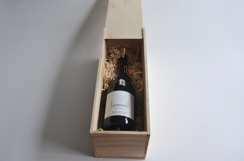
Typography is another essential aspect of your packaging design. The font you select should be legible and easy to read while still maintaining a sense of style and personality. Experiment with different font styles, sizes, and weights to find the perfect balance between readability and visual appeal.
Imagery and Illustrations
Incorporating imagery or illustrations into your wine packaging can help tell a story about your brand and the wine itself. Whether you opt for a minimalist approach with simple, elegant line drawings or a more detailed, intricate illustration, make sure the imagery complements the overall design and communicates the desired message.
Material Selection and Sustainability
In addition to the visual design, the choice of materials for packaging your wine products can also make a significant impact on consumers. More and more, customers are becoming environmentally conscious and appreciate brands that prioritize sustainability in their packaging choices.
Consider using eco-friendly materials such as recycled glass, biodegradable labels, and natural cork closures. Not only will this appeal to environmentally conscious consumers, but it will also demonstrate your commitment to reducing your brand’s environmental footprint.
Functionality and User Experience
While aesthetics are undoubtedly crucial, it’s essential not to overlook the functionality and user experience of your wine packaging. Consider the ease of opening and closing the bottle, as well as the overall durability and stability of the packaging. A beautiful design can quickly lose its appeal if the packaging is difficult to use or prone to damage.
Aligning Your Packaging Design with Your Target Market
Understanding your target market is a critical aspect as well. Consider the demographics, preferences, and tastes of your ideal customer, and ensure your packaging reflects these factors. For example, if your target market appreciates traditional, classic wines, a minimalist, elegant design may be more suitable than a bold, contemporary look.
The Power of Wine Packaging in Telling Your Brand Story
Finally, remember that your packaging is an opportunity to tell your brand’s story and convey your unique selling points. Use your packaging design to communicate your brand’s values, history, and personality, creating a memorable impression on consumers and setting your product apart from the competition.
Conclusion:
In conclusion, choosing the right design for your sea moss detox cleanseBy taking the time to create a well-thought-out, attractive, and effective packaging design, you can significantly enhance your wine’s chances of standing out on the shelves and capturing the attention of potential customers.